Friday, 9 January 2015
Thursday, 8 January 2015
Wednesday, 7 January 2015
Left Inside Editing
we decided to use a sketch effect on this image because as a group the case studies we looked at individually had some sort of effect on their image.
Monday, 5 January 2015
Spine and Back Cover Editing
we used the same x font at the spine
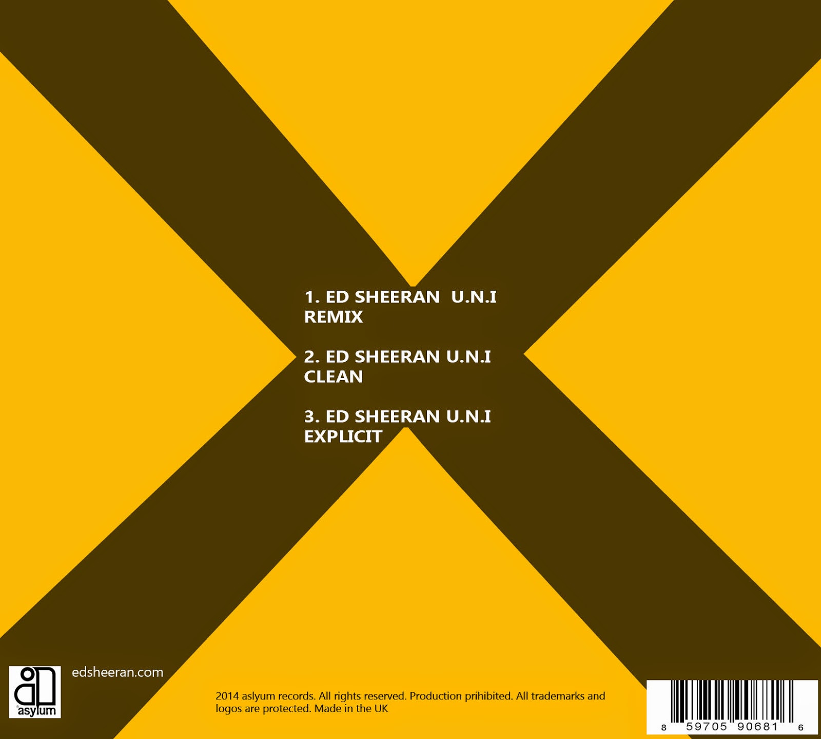
This is the back cover and we used the same x font used at the font cover. we decided to put the song list in the centre so that it does not clash with the yellow and stands out.
Front Cover Editing
We looked at font sizes of the letter x and decided to use the one which is highlighted since it is simple.
we could not take any pictures with the DSLR camera because the actor was busy therefore we had to use a still image from the clip and we decided to use this shot since it looked clear and had better lighting than the other shots.
we could not take any pictures with the DSLR camera because the actor was busy therefore we had to use a still image from the clip and we decided to use this shot since it looked clear and had better lighting than the other shots.
Subscribe to:
Comments (Atom)


